
Coconut milk packaging that says shake shake shake
Expressive Typography
Friends of mine recently returned from a week travelling through the jungle in West Africa. They raved about the abundance of fresh coconuts keeping them hydrated as they hiked through the jungle. But the best part was adding a little rum and creating Cocolocos in the evening.
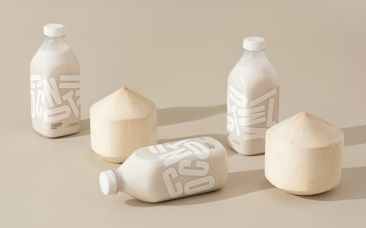
This reminded me of Grinning Face Coconut Milk Grinning Face Gelato a 100% natural coconut milk designed by Leo Burnett Design Leo Burnett (LBD) from Toronto, Canada.
Large letters cover the clear bottle, like Typography Tetris spelling out the words Coconut Milk. It's fresh-pressed and contains only two ingredients, water and coconut. Naturally, it begins to separate and is best enjoyed after a good shake. The jumbled letters are used to educate and remind the consumer to shake before drinking. LBD decided to celebrate the unique characteristics of coconut milk by using a clear bottle rather than hiding the separation. The word coconut milk can be read when three bottles are displayed together on the shelf. I can imagine the conversations around readability when proposing something like this, so including the product name in the small black text seems like a good compromise. The letters are set in a condensed typeface representative of the squeezing required to make freshly pressed coconut milk. I'm sure it's also a functional decision allowing the designer more room to place the letters around the bottle. The white-on-white colour palette speaks to the minimal approach to ingredients, no stabilisers, gums or preservatives.

Typography is a great tool to express movement and the characteristics of the product, adding another level of detail for the consumer to understand more about a product. Letters come in thin and bold, sharp and rounded, wide and condensed, giving designers a complete arsenal to work with.
What other products could utilise expressive typography?
Marshmallows — Light and puffy typography.
SOFTA is a free font described as "good for big soft puffy words".
Jerky — A ridged, sturdy, tough piece of typography in long thin strips.
Fudge — A nice big slab serif, well-formed block-like letters.