I imagine many of us have been staring out our windows from isolation, watching the world go by. Psychologists say that windows are gateways to the human mind, a place where we can listen to deeper and quieter thoughts. But how does this relate to packaging design? Can brands emulate this feeling?
Read MoreHoly crap, frenzied panic buy, empty shelves, no pasta, canned food or soap but the real talking point seems to be the lack TP, bog roll, toilet tissue or whatever you call it. The shelves have been completely 'wiped' out.
Good morning folks, rise and shine, there's not a cloud in the sky today and it's sweltering out there. Well not quite yet in London but the mercury is set to rise this week, with the BBC predicting temperatures will nudge 16 degrees. We say goodbye to winter and hello to sunshine and chilled beverages.
Last Friday the weekend arrived early as I found myself at Brew Ldn just after midday. The goal was to *cough* network, the outcome was intoxication. I was like a kid in a candy store, umm... alcohol and kids, maybe not an appropriate reference. Anyway, the craft beer scene is exciting both visually and on the taste buds.
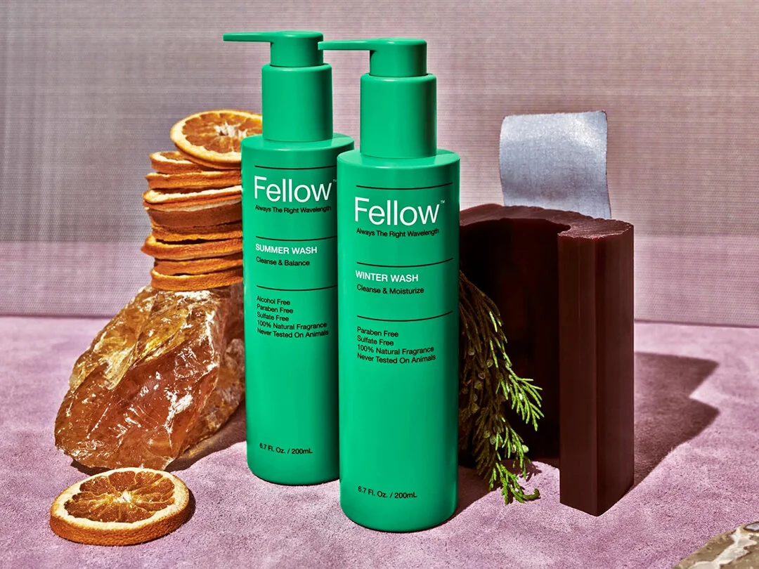
In 2013, with the help of RoAndCo studio, Fellow Barber diversified their offering with a grooming line of retail products. These products reflected the traditional barbershop masculine boys club culture. Utilitarian, industrial, typographic packaging design that referenced vintage oil and paint cans.
Read MoreDonkey Brewery on the island Santorini in Greece have the market cornered, but there's a new kid on the island. Malt ‘n Marvel have launched their first two products: a pale ale and Santo larger, aimed at the local market and the overcrowded tourist population.
Read MoreAtipus reprinted the previous decade of Vi Novell labels with a scratchable layer, which hid the original design. Consumers don’t know which label they've picked until it’s revealed, a concept that reflects the delight of unwrapping.
Read MoreThe Mighty Green packaging also includes an anthropomorphic character called Hempy. Anthropomorphic means giving inanimate objects human characteristics. Hempy is a nine-point cannabis leaf with arms, legs and a feel-good friendly smile.
Read MoreVinvinvin (Wine Wine Wine), a wine bar in Montreal is good good good. A name that is reflective of the three people involved in the wine process, the people who make it, the people who serve it and those who neck it (admire the complex flavours).
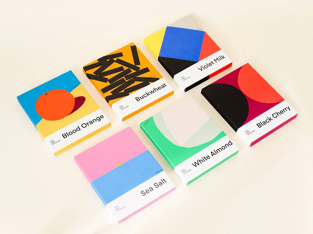
Read MoreOriginally it was nicely wrapped up in cellophane, but they always had grander plans for their packaging design. Ish studied illustration at art school and Matt was always a keen connoisseur of art and design, so they designed all of the Ocelot packaging themselves.
Read MoreCuna de Piedra is a company that's concerned about the inequality and injustice at the heart of the chocolate industry. Cuna de Piedra is driven to create a supply chain that's fair for Mexican farmers, with no shady middleman.
Read MoreIce cream you scream we all scream for great packaging design. Snask a design agency from Stockholm, Sweden has your "eat healthy" New Year's resolution covered, with their internally developed ice cream brand Wauw Ice Cream.
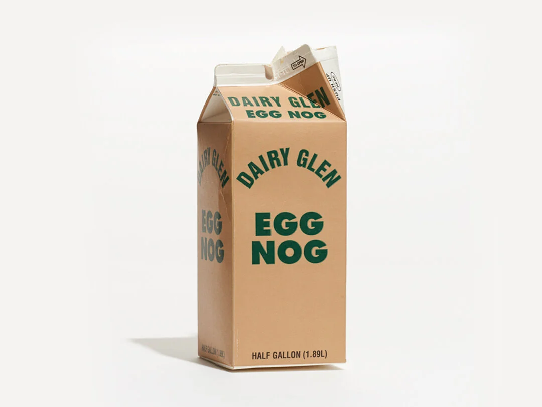
Read MoreI'm experiencing my first winter Christmas this year. Instead of beaches, BBQs, and jandals, it's been winter markets, ice skating and egg nog. I used this as the inspiration to find an eggcellent piece packaging design to write about. (Sorry I had to).
Read MoreSo what makes a cider fine? You're probably thinking, all ciders are made from apples, that's pretty natural. Back in the '70s that was the case, but in more recent years cider has been produced on a mass scale with artificial ingredients.
Read MoreAnagrama Studio designed the packaging for Yema. It's a food, baby, hygiene and homewares company from Mexico. They make everything from shampoo to spaghetti. With such a diverse range of products, materials, sizes and containers this project would have been a gigantic undertaking.
Read MoreNaturally, it begins to separate and is best enjoyed after a good shake. The jumbled letters are used to educate and remind the consumer to shake before drinking. LBD decided to celebrate the unique characteristics of coconut milk by using a clear bottle rather than hiding the separation.
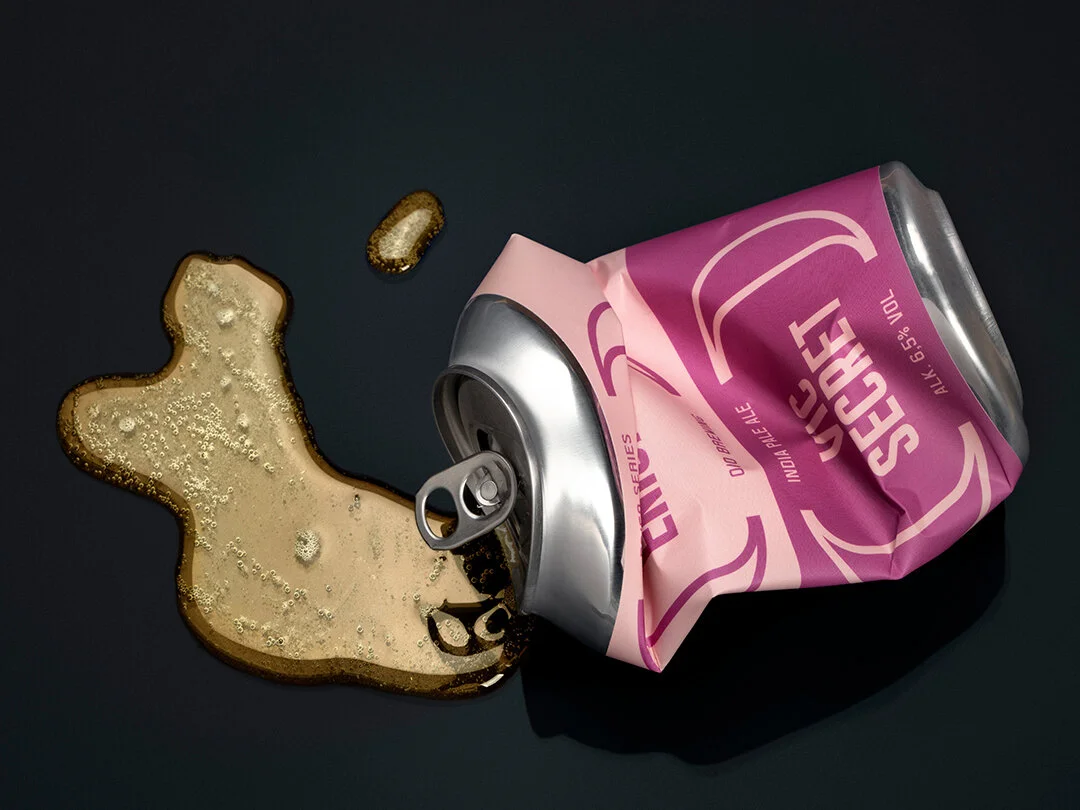
Read MoreO/O Brewing was started by two friends Olof & Olle, hence the name O/O. They have a series of beers designed by Lundgren Lindqvist called 50/50, once again referencing their partnership but also the ingredients. Each beer in the 50/50 series is made from a half and half mix of two different types of hops.
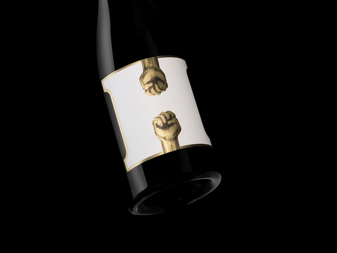
Read MoreThe Alphabet of Wine is an idea from South Australian winery Alpha Box Dice. They're creating a bottle of wine for each letter of the alphabet from A to Z. Twenty-six letters, twenty-six unique winemaking projects that experiment with the diverse varieties grown in McLaren Vale.
Read More


