We're buzzing about Lone Bee Sparkling Mead packaging design
Untraditional Hierarchy

Although I'm now based in London I have a soft spot for New Zealand design agencies and the awesome work they produce. One Design is one of those agencies. They're behind brand identity and packaging for Lone Bee, a Sparkling Mead. Mead is an alcoholic beverage created by fermenting honey with water. New Zealand is the home of Manuka Honey so Lone Bee was obviously going to be spectacular.
At sunrise, the lone bee leaves the hive on a forging journey in search of nectar. Travelling within a 5km radius from the hive the lone bee can make this treacherous trip at least 10 times a day. The design humorously depicts the bee’s journey, and the dangers encountered along the way. Skeletons, snakes, ghosts, sharks, erupting volcanoes & a lake monster, all beautifully printed using spot black and gold foil.
We have all heard the jokes about clients wanting to make the logo bigger, bolder and centred. Terms like brand recognition are thrown across the boardroom table. What I like about Lone Bee is that it challengers traditional label hierarchy that's seen throughout the beer and cider category. The typography all set in Vintii Bold weaves down and around the bottle, with some words upside down, which the traditionalists and risk-averse would say is a packaging design no no.
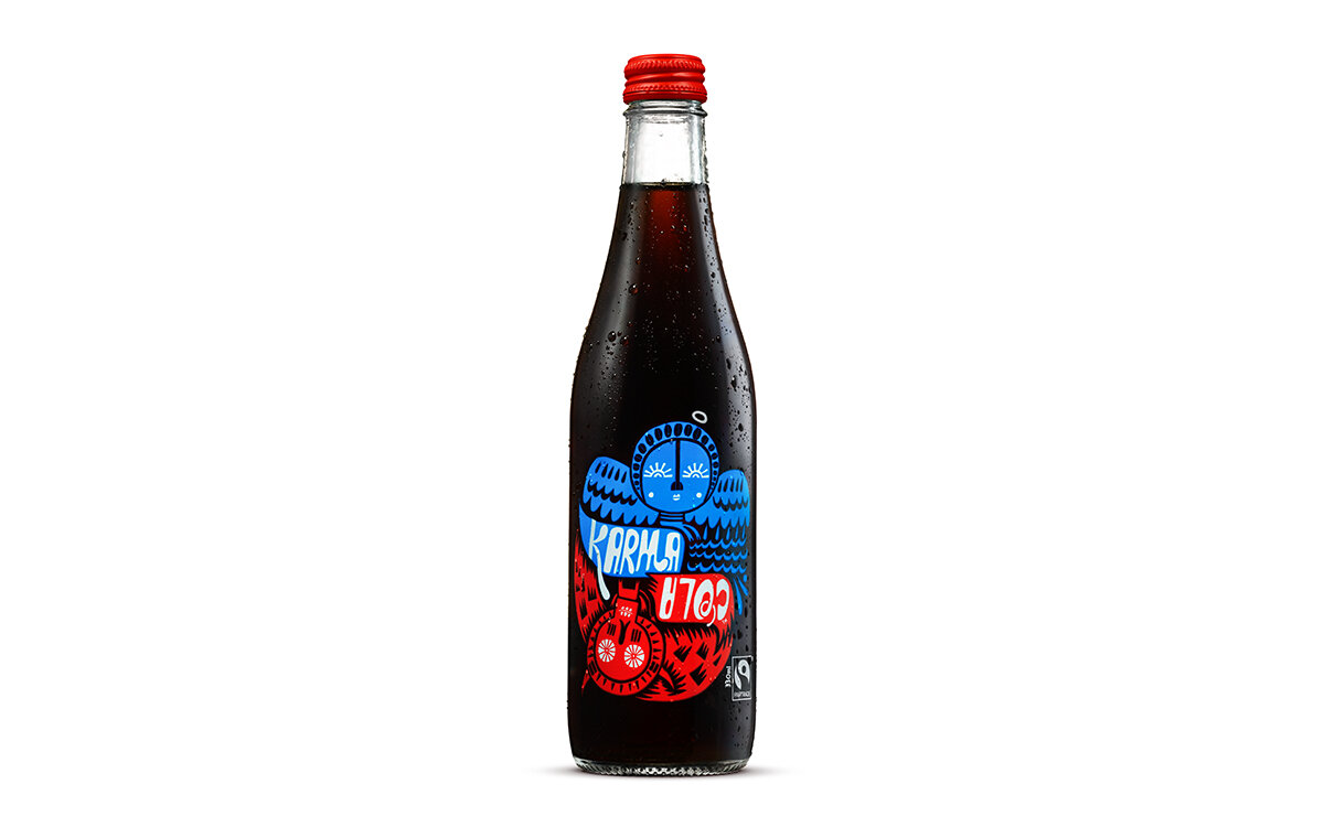
Another example of this...
On the Karma Cola packaging, Cola is placed upside down. A daring move when Coke Cola & Pepsi are your main competitors.