
Cuna de Piedra's packaging design draws on the integrity of stone
Colour Consistency

This week I discovered the work of VVORKROOM as I was scrolling through my Instagram feed. Who would have thought my procrastinating would lead to such a valuable find. VVORKROOM recently created the brand and packaging for Cuna de Piedra.
Cuna de Piedra is a company that's concerned about the inequality and injustice at the heart of the chocolate industry. Cuna de Piedra is driven to create a supply chain that's fair for Mexican farmers, with no shady middleman.
Firstly VVORKROOM needed a name that would positively present Mexican Cocao to the world. Cuna de Piedra means "cradle made of stone" drawing on the idea that Mexico is a cradle for cocoa production. Mexico has a strong connection to stone, since pre-Hispanic times stone molcajetes (mortar and pestles) have been used in the preparation of food, and stone is commonly used in Mexican sculpture. The central work of the packaging has a lovely richness and weight, which beautifully speaks to cocoa as a raw product, but at the same time the floating stone suggests weightlessness, maybe representing cocoa in its finished form chocolate, smooth and light.
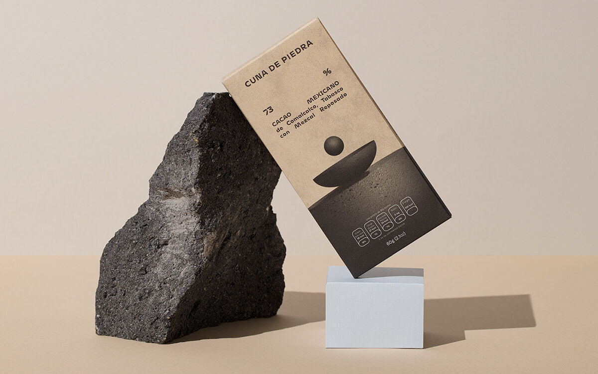
VVORKROOM selected the typeface Mohol. It's a high contrast sans serif that has both smooth and weighty elements. The typography is all justified, creating a strong block of text mirroring again the concept of stone or chocolate in its finished form.
What I love most about Cuna de Piedra is the harmony and consistency across the different SKU's. Having the same image but tweaking the colour across the range creates a strong family. For consistency, it's important to get the same hue and vibrancy across the series of colours. Using colour to differentiate between SKU's, flavours or varieties is probably the most commonly used technique in packaging design, it's something that customers are aware of and look for when purchasing.
This is a technique I also used on a recent chocolate project, called Percentage Chocolate, which can be found on my website. Look at me shamelessly plugging myself.
