Ice cream you scream we all scream for great packaging design.
Depth & Perspective

Ice cream you scream we all scream for great packaging design. Snask a design agency from Stockholm, Sweden has your "eat healthy" New Year's resolution covered, with their internally developed ice cream brand Wauw Ice Cream. This innovative frozen delight with no added sugar was developed in conjunction with a Danish creamery.
For the name, an onomatopoeic word was chosen, which is very fitting for the ice cream category. It's joyful and speaks to the idea of devouring ice cream. Very few companies have an exclamation mark as part of their company logo but Wauw! use it to reinforce the excitement of the ice cream experience. The rhythm and movement of the typography with its rounded corners references ice cream’s smooth creamy texture. Wauw! is presented in an elegant black container, something that is often reserved for the luxury ice cream brands. Luxury was not where Snask wanted Wauw! to be positioned, so typeface selection was very important, moving Wauw! closer to the idea of tasty, creamy, and friendly.
Snask honoured the conventional ice cream packaging language by using the classic ice cream ball image. The first bite is with the eye, and a perfect geometric scoop of ice cream looks extremely tasty. Ice cream is not an easy product to photograph, as it melts quickly under studio lights. There is plenty of fake ice cream recipes online with food photographers having their tricks from mashed potato to frosting and even cornflour mixed with hair conditioner.

The highlights and shading of the ice cream scoops offer form, perspective and depth to the packaging. Snask decided to mirror this 3D effect with the wordmark by adding a shadow so it harmonizes with the ice cream balls. The idea of drop shadows is often frowned upon by the modern designer, but when strategically used and not overdone the packaging design benefits, with type and image working perfectly together.
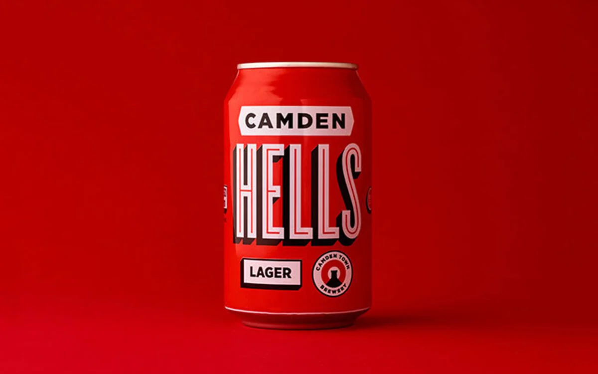
Another example of typography with depth?
Camden Town Brewery’s typographic labels are designed to suit each beer’s character, and have a drop shadow inspired by old signwriting.