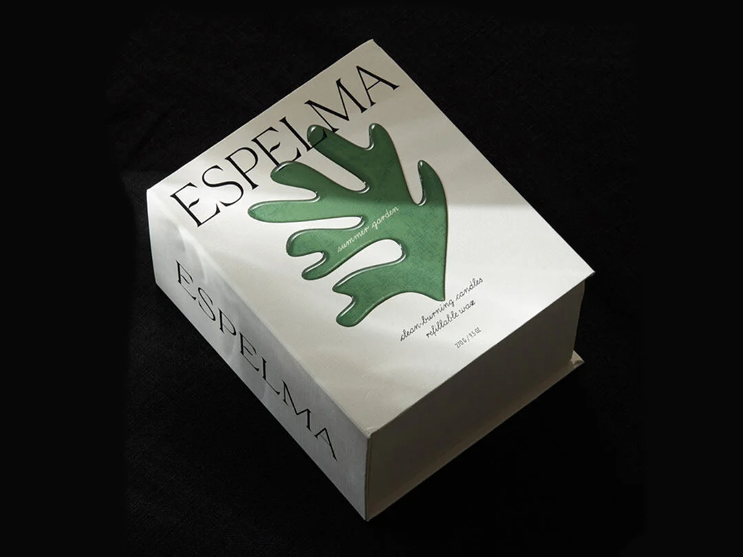
Espelma in Catalan means candle or melted wax. The Espelma mark was custom-drawn, and they included a subtle burning flame at the centre of the uppercase E making it into an ownable mark that adds to the story.
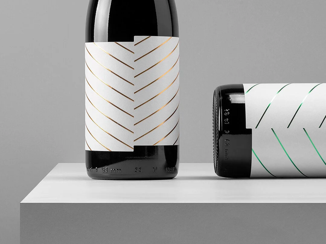
Read MoreThe asymmetric wine label shape and foiled lines were inspired by the elm tree's leaf structure. A beautiful simplistic graphic pattern inspired by nature. Patterns from nature inspire all sorts of structures, architecture and packaging forms.
Read MoreLand Chocolate was started by Phil Landers after discovering proper chocolate during a visit to a Guatemala cocoa field. He refined his craft at Mast Brothers and now, in an East London workshop, creates "bean-to-bar" chocolate. Land is built on the idea of connecting customers to the origin of the ingredients.
Read MoreThe thing I miss most about doing the weekly grocery shop, now that I do it online, is perusing the packaging design. Well, that and pushing the trolley like a race car around the supermarket.
Read MoreMezcal the smokey cousin of tequila has become a hot topic, attracting celebrity endorsements, the opening of mezcal bars and investment from the big liquor distributors.
Read MoreIn Caribbean folklore the dark Duppy Spirits travel between the islands, visiting distilleries and stealing rum left to age in oak barrels. These pesky spirits are true blending masters and only take the best.
Read MoreAt sunrise, the lone bee leaves the hive on a forging journey in search of nectar. The design humorously depicts the bee’s journey, and the dangers encountered along the way.
Read MoreI always pop into independent grocery stores and boutique shops to see what packaging design I can find. In the large fluorescent chiller was Vybes an Organic Hemp Cannabidiol (CBD) infused drink.
Read MoreThe beer market is overrun with independent breweries all vying to be different in a sea of different. Many are heavily illustrated, some are simplistic and others typographic. Adding another one to the mix is a real challenge.
Read MoreI was recently in Portland and couldn't resist a visit to Stumptown Coffee Roasters. The comical thing is I don't like coffee. A designer that doesn't drink coffee, I know, absurd. I was going for the good vibes and packaging design.
Read MoreI like to tell people the Sawmill Brewing Pilsner was made for my tastebuds. Is this a case of great packaging design making the product taste even better? That's hard to say, but I'm never disappointed when popping the cap off this dark amber bottle.
Read More


